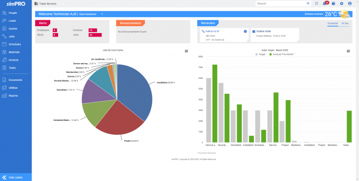
simPRO has now launched a new look interface along with several other features in its latest release 20.1.16. Users are able to switch between the new and classic look using a simple toggle switch. There are several design changes for the new look. The main change is that the menu bar is now vertical on the left hand side and can be minimised. This gives users more screen real estate to look at. It has also introduced icons instead of words in the menu to further save space, though users are able to switch to seeing text as well. It has also updated several icons with a more modern feel.
Other improvements
Alongside the new look it has included several other features in this release. It is now possible to see the original scheduled time of a job as well as the actual time the job was delivered. This will help with analysis of performance in future. The new schedule comparison report does just this. It notes and highlights discrepancies enabling organisations to judge performance better with a new metric. This may also highlight challenges employees faced in the organisation that are not properly accounted for. simPRO also announced a series of bug fixes with this release.
Enterprise Times: What does this mean
For many customers, this means change. However, with the option enabling customers to continue using the classic for the moment, there is less likely to be resistance. What this does mean is that simPRO will look much better to prospects with a more modern look and feel. This is just the latest phase of the UI improvements. What will simPRO deliver next?


