 Krys Murphy")
This may sound like a very easy subject for most but I do find that a lot of people still don’t know how easy it can be to create a chart in Excel. My first question to all of you is “Why do you want a chart?” the answer is simple “to make the multitude of figures easier to understand at a glance.” Looking at a sheet of numbers let’s say for sales figures for sales personnel, can be difficult to understand quickly who is doing well and who is not. A chart makes it easy to see. But I shall start by saying that even though there are lots of lovely features inside the charts function, with many choices of colour shape and design. Please keep it simple and keep in mind your audience, so that they can easily read off the information they are looking for, without being overwhelmed with “design”.
Start off with the data in a spreadsheet laid out in the order you would like to see as a chart. Here is an example.
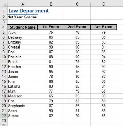
As you can see the numbers are all very similar. So at a glance who is the best student?
- Select the entire area of data including the words.
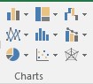
- From the Insert Tab. Look in the Chart section for different chart types.

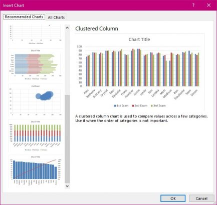
You have a choice here. You could select Recommended Charts Tool.
Or one of the other charts listed. But note that not all data fits the chart type you might choose. I shall show you the difference.
- Select the Recommended Chart Tool.

The list of choices is restricted to what Excel believes will work with the data selected. Therefore, here we have only column, bar, scatter and bubble styles to choose from. I could argue that neither bubble nor scatter will help my audience understand the data.
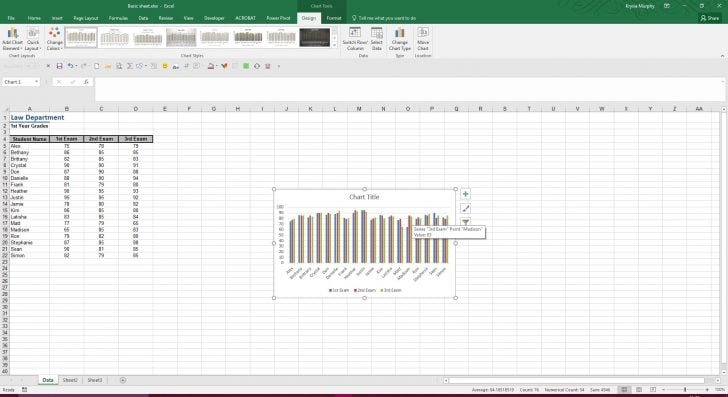
If you like what you see here then select one and your chart appears before you.
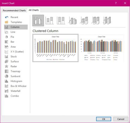
Alternatively you could select the first choice in the charts section and preview what each selection looks like before you accept it. A try before you buy thing.
Each tool displays the options held within. This is the first a column style.
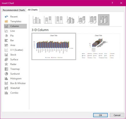
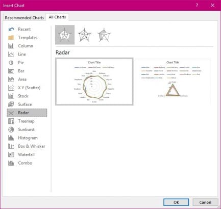
If you go through all of them you are sure to find one that will suit your data.
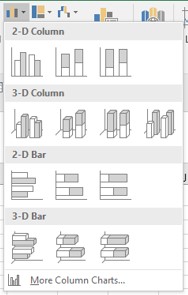
- Select More Column Charts… at the bottom of the list.
From here you can see all the different types of charts and there different designs all depicting the data you have selected in your spreadsheet.
Here are just a few examples.
The choice is yours. But remember that the reason you are creating a chart in the first place is to make it as easy as possible to understand the data.


